Context
Upon starting work at Asurion, I was tasked with finding ways to “humanize” the process of filing a claim online. Both customers and internal executives were describing the existing design and overall experience as “sterile” and “robotic”. After walking through the experience myself, I began to understand this feedback. There were points in the process where customers were telling us personal information, yet we did little to acknowledge what they had told us. At other points, we’d provide customers with options to go down every possible path in the process, but we did little to guide them down the path that made the most sense for their scenario.
It became clear that while our teams at Asurion had been working hard to optimize for success, we had not been thinking much about our customers’ emotions. My task was to create a prototype representing the vision for the ideal state of the claim flow considering human emotions, and create a list of suggested improvements for the team to test and implement.
Research
In order to be sure I could identify as many opportunities as possible, I gathered a team of a few coworkers from different design disciplines, all of whom had a long tenure with the company. Once I’d found a group of people who were interested in helping with the effort, the next challenge was to define the problem to be solved in a way that allowed us all to speak in the same terms. Creating a definition of what it means to be human, and then translating that definition into an interface seemed like a difficult task, so I did some research to learn how other companies might be addressing this problem.
I soon found the article, “Humanizing Digital Interactions” by Bruce Temkin and Isabelle Zdatny. This article shows data supporting the idea that experiences which engage customers emotionally are more likely to drive loyalty behaviors, like recommending a service to a friend, than experiences which only optimize for their success or effort. Not only did Temkin and Zdatny clearly define an industry-wide problem, but they also provided an excellent set of terminology to frame the conversations of our working group for the humanization effort.
Identifying the Opportunities
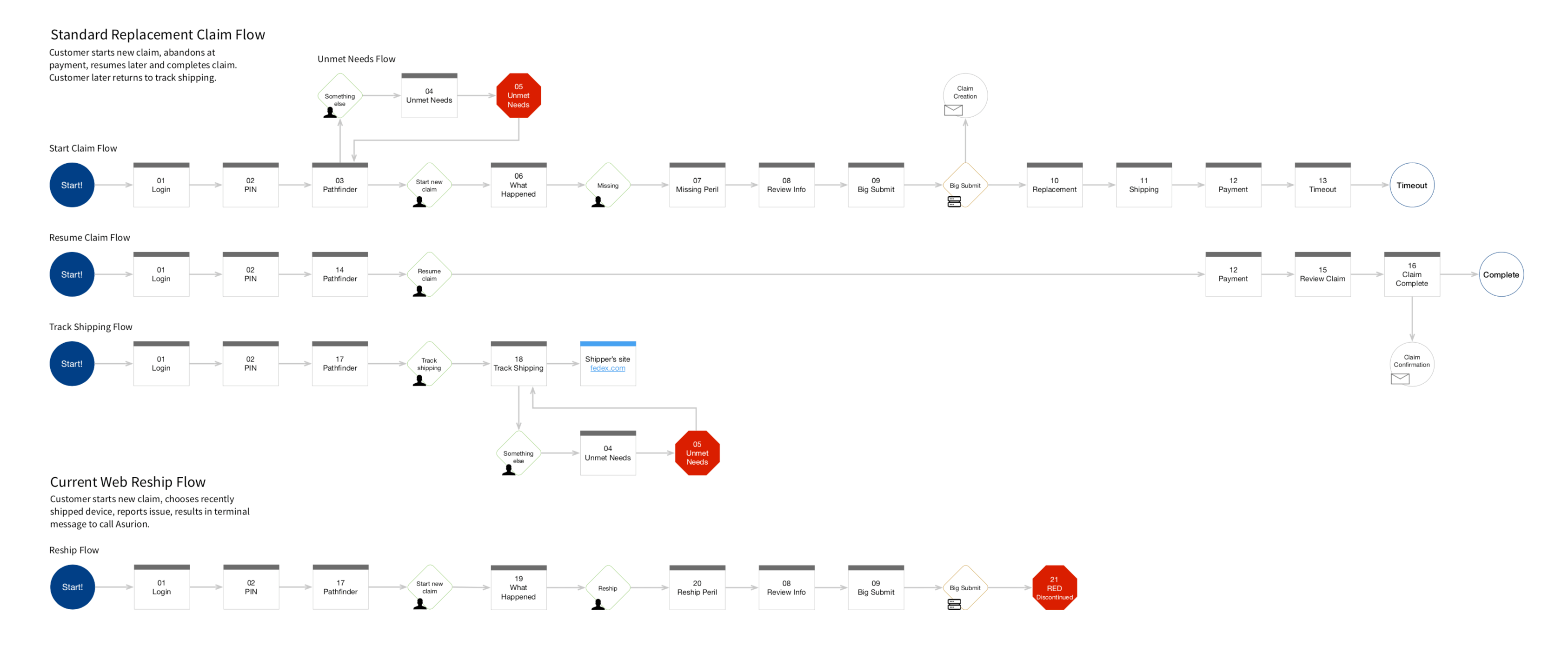
The process for filing a claim for a damaged, lost or stolen phone can vary quite a bit based on where the customer is in the experience and what specifically has happened to their phone, so finding opportunities for improvement across all the possible paths seemed like a daunting task. In order to make this process more manageable, we decided to focus on a specific story and find opportunities within the limited scenarios inside that story. The story goes something like this:
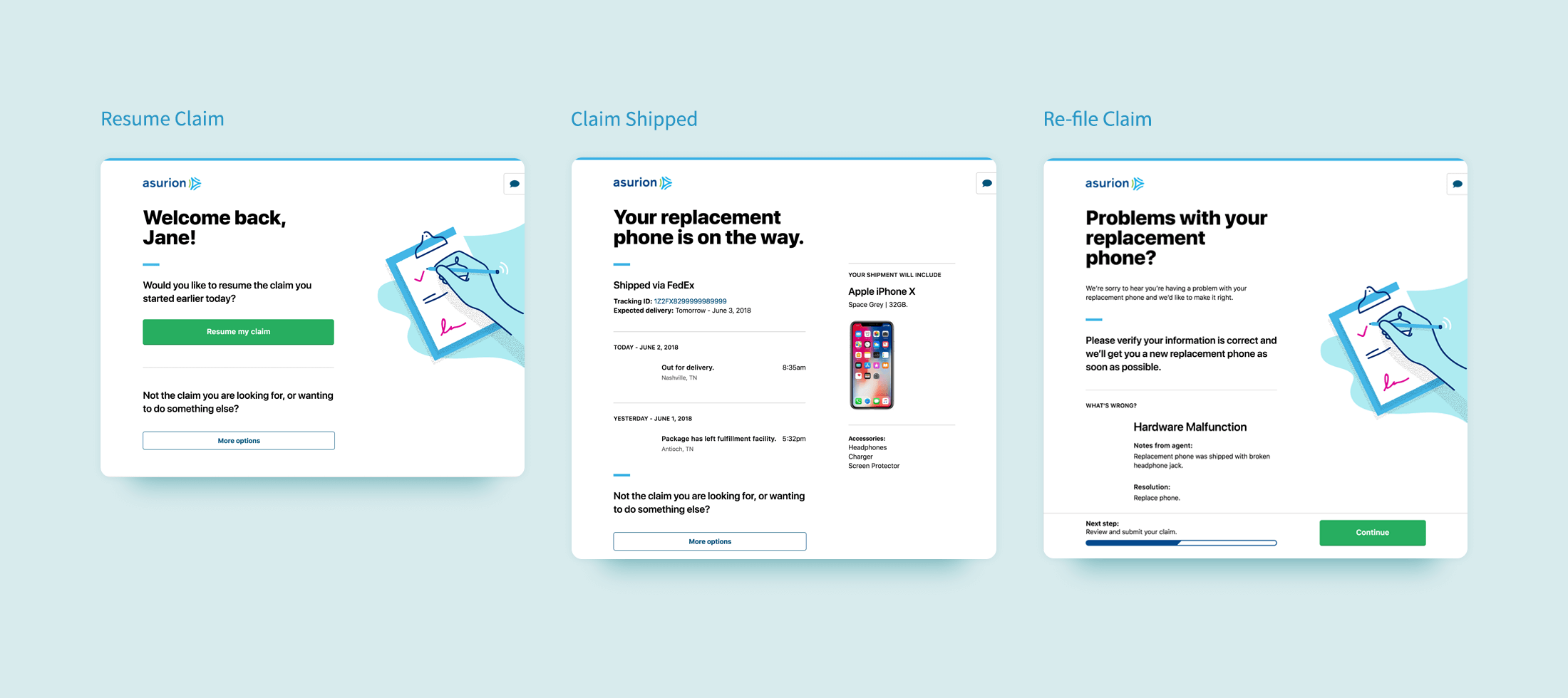
Jane visits her local carrier store and purchases a new phone. She’s offered an Asurion protection plan and decides to add it to her purchase. After leaving the store, she receives a welcome email from Asurion summarizing the benefits of her new protection plan.
About a year later, Jane’s phone is stolen. She searches her email inbox and finds the welcome email she was sent upon enrolling. She finds a button to file a claim in this email and begins the process of filing a claim. Upon learning that there is a deductible required to get a replacement phone, Jane decides to think about whether she wants to complete the claim and exits the process.
Jane ultimately returns to the claim process, completes her claim, and receives a tracking notification. She receives her new phone the next day. Upon receiving her phone, she notices that her headphone jack isn’t working. She chats with Asurion’s support center, where an agent confirms that her problem is a manufacturer’s defect and directs her to file a second claim on the replacement phone. Jane completes the second claim and receives a fully functional replacement.
After defining this story, we had a clear set of user flows to address:

Providing Supportive Feedback

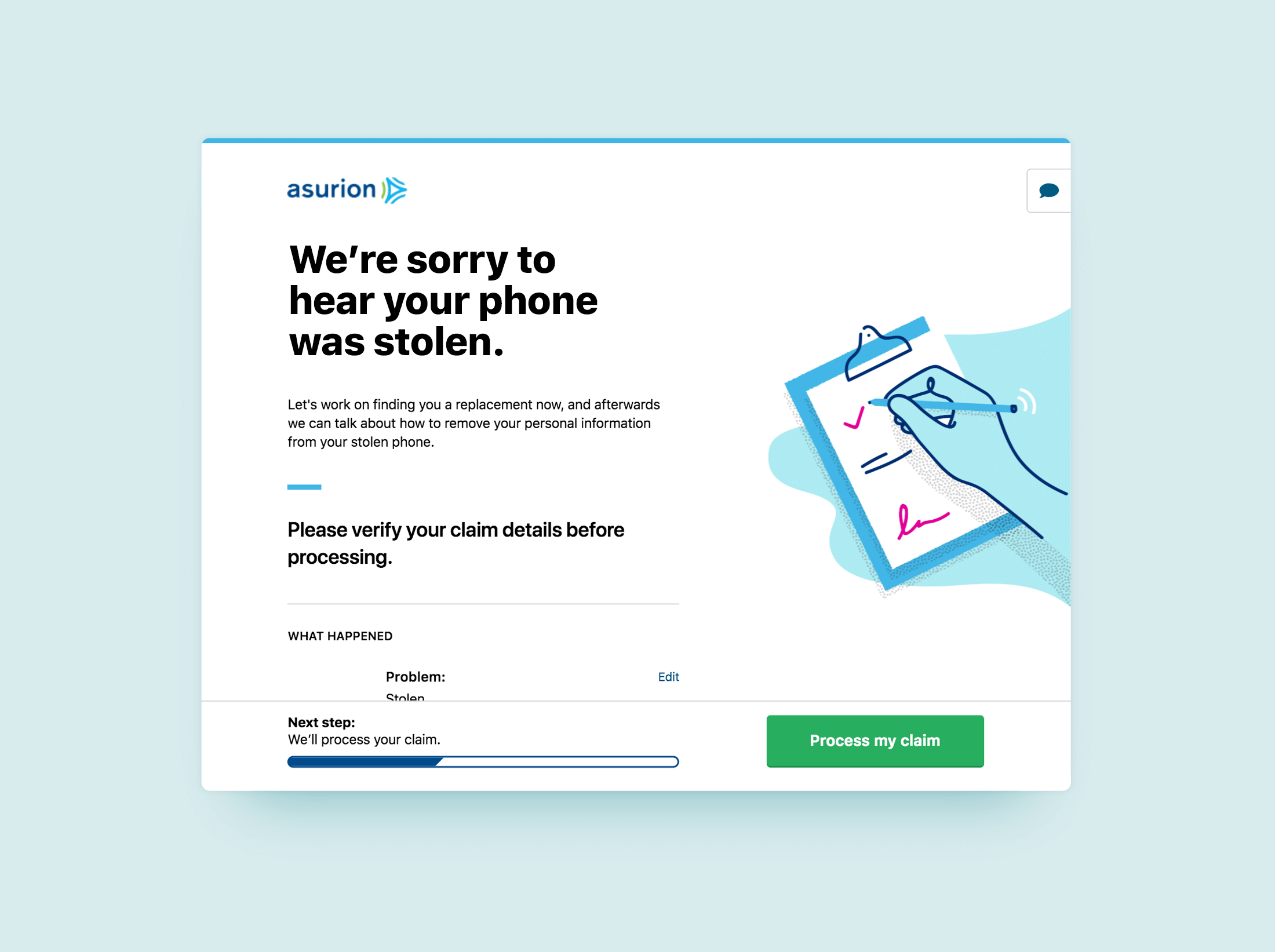
In session replays, there were a few screens where customers would pause, scroll a bit, and then ultimately click to find our customer support number. Often these screens had sparse information around the customer’s progress or next steps, and there was little acknowledgement of the information the customer already provided.
Refinements:
- I worked with a content specialist to identify likely emotions which our customers might be feeling during the process of filing a claim, and create new content which responds to those emotions through modulation in tone. By showing attention to likely customer emotions, we hoped to keep our customers’ experience positive.
- A step tracker was also introduced to give customers a sense of progress and help them anticipate the next steps. You may notice that the total amount of steps isn’t visible to the customer. The was an intentional omission, as the total amount of steps in the process can change for customers based on their answers to certain questions.
Infusing Personality
In post-claim surveys we ask customers, “How did you feel about your experience with us?”. Responses are provided on a one to five scale, with one being negative and five being positive. We’re always looking for ways to move the responses to these surveys in a more positive direction. Since we’d received qualitative feedback referring to the claim process as “sterile” and “robotic”, stakeholders were receptive to the idea of infusing some personality into this process.
Refinements:
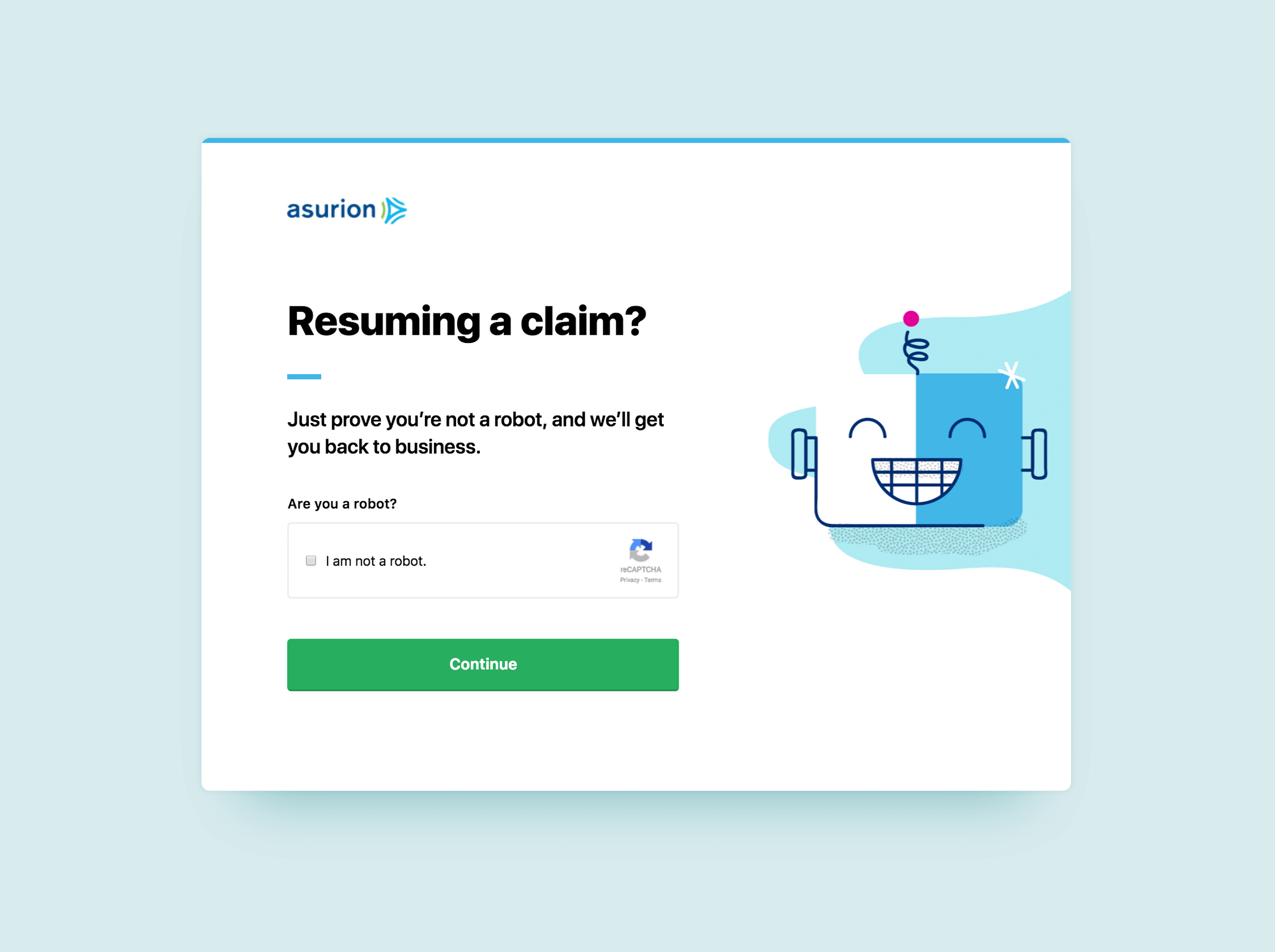
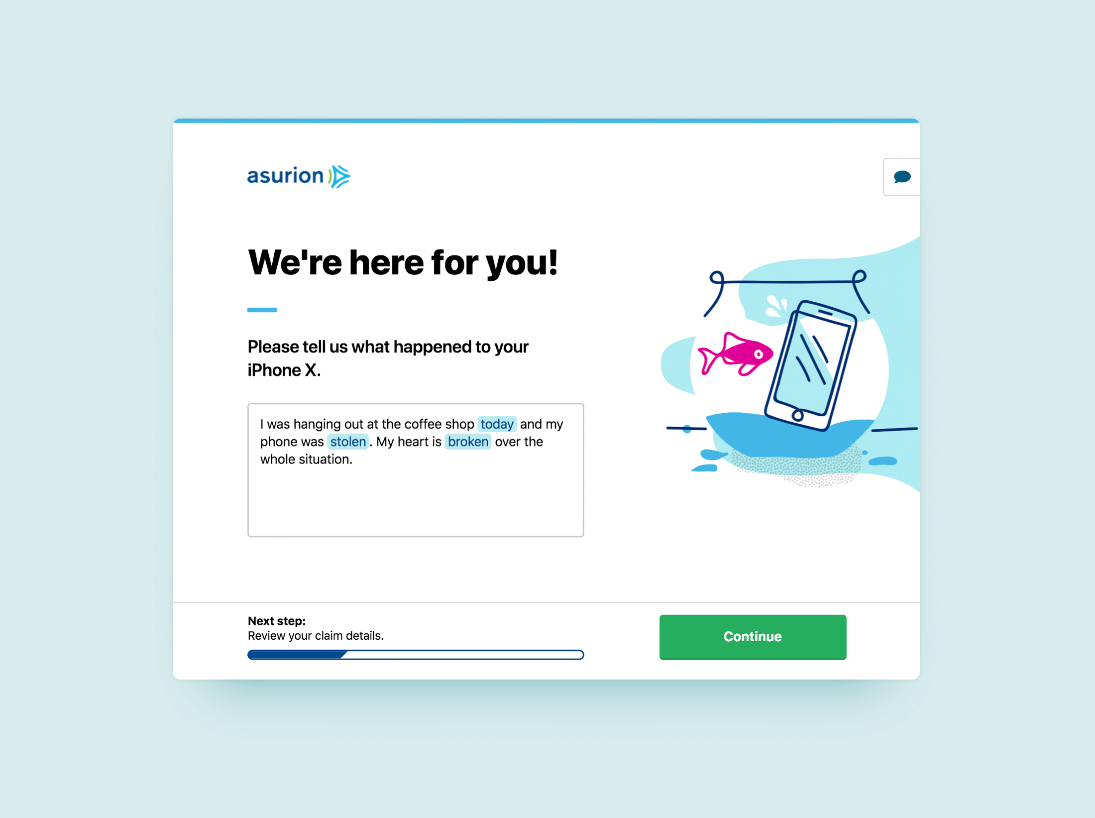
- We identified areas where humorous or expressive illustrations could be added to the filing process, being sensitive of customer emotions and only bringing levity to select steps in the process. In customer interviews regarding the updated claim flow, there were unprompted positive reactions (smiles, comments, and laughs) to these illustrations.
Disclosing the Deductible

In my search for indicators of emotional frustration within the claim filing process, I learned that our team tracks what we refer to as “leakage”: customers who initiate a claim but then abandon it later in the process. The point in the process with the highest leakage is when we ask customers to pay the deductible associated with the policy. It wasn’t surprising that customers would leave at the point of payment, but recordings from the customer service call center indicated that many of these people choose to call and complain at this point. Their top complaint was that they were never aware that there was a deductible cost associated with their plan.
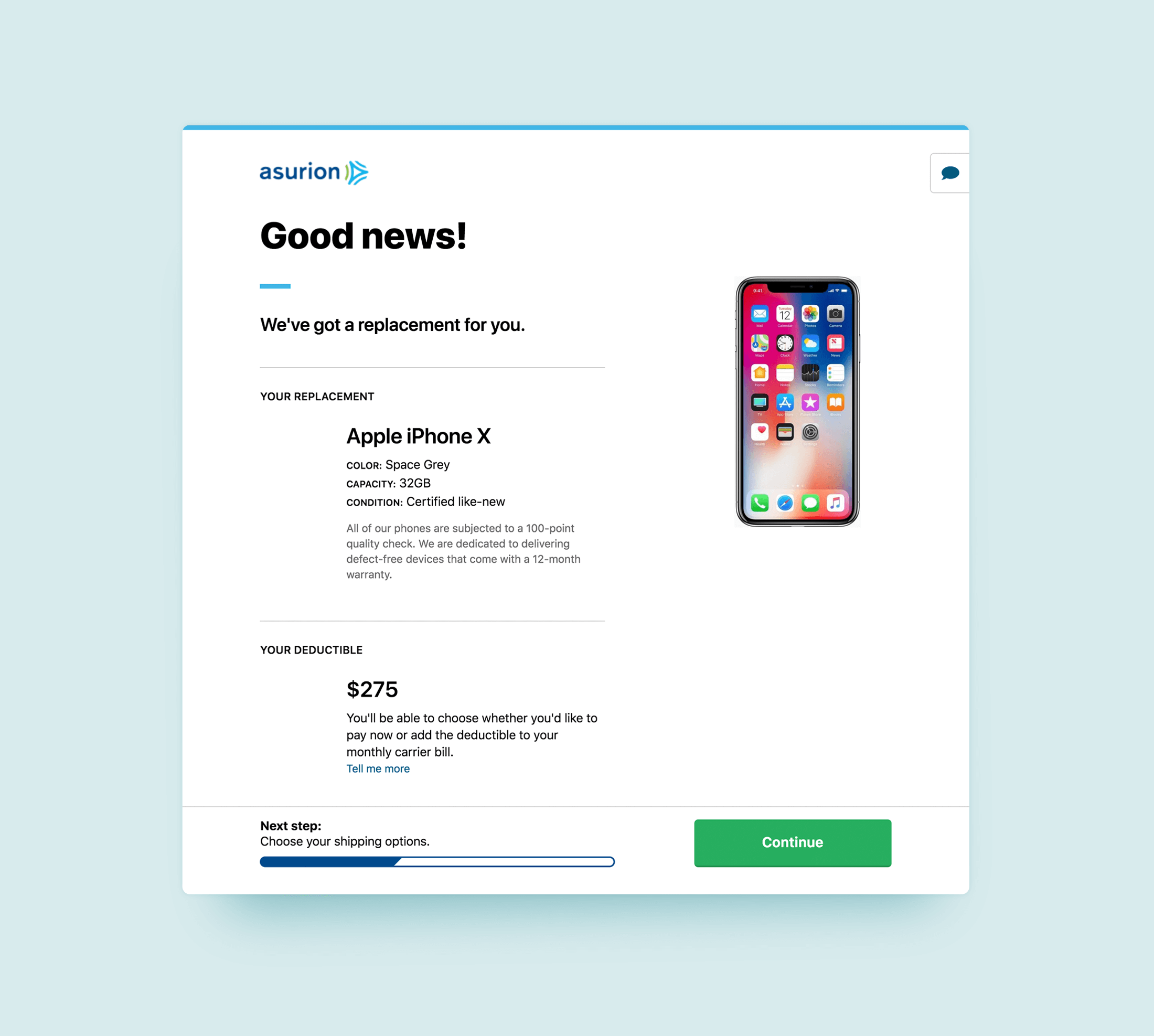
While making customers more aware of their deductible fell outside of the scope of this project, it was possible to make customers aware of their deductible earlier in the claim process. The existing design only revealed the deductible cost at the point of payment, and I wanted to test whether introducing this cost several steps earlier and combining it with positive messaging would decrease leakage at the time of payment.
Refinements:
- A disclosure of the deductible was introduced several steps earlier than the prior iteration, at the moment that the system determines an outcome will require a deductible, which is also the moment that the customer learns that they will receive a new phone. By leading with the positive message of the replacement phone, we hoped to lighten the emotional blow of the deductible.
Decoding the Customer's Intent

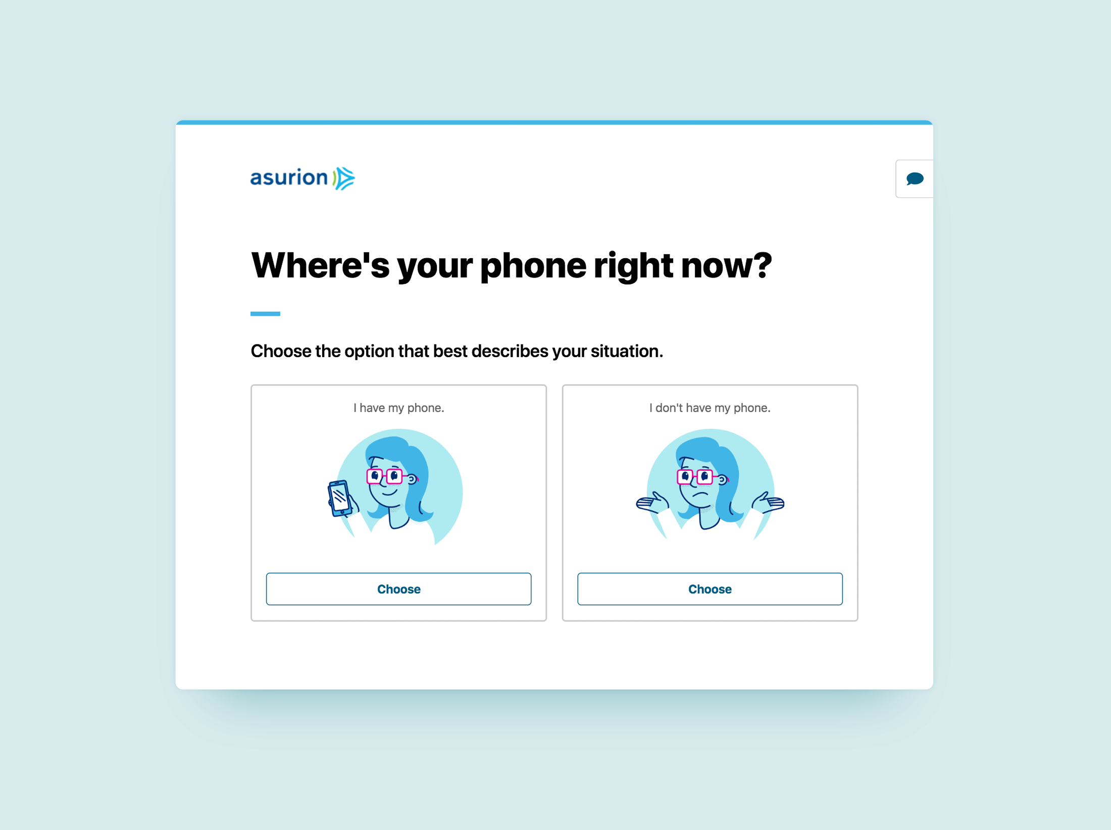
In session replays, I noticed signs of emotional distress on what we referred to as the “pathfinder” screen. Customers were scrolling frantically and clicking in and out of the links attempting to find what they needed. This screen was shown once a customer started a claim and exited the process for a number of reasons, whether the claim was finished, abandoned, or fulfilled. It featured three buttons in a horizontal row, all of the same visual weight and style. The buttons read “resume claim”, “track shipment” and “something else”. While all three buttons were necessary, they were not all necessary to customers at specific points in their journey.
Refinements:
As I reviewed the pathfinder screen, I saw opportunities to decode the intent of the customer at several possible points in their journey.
- If I’ve recently initiated a claim but haven’t finished it, I am most likely to want to resume the claim. The “resume claim” button should dominate the screen, while the “track shipment” (if available) and “something else” buttons can be displayed at a lower visual weight.
- If I’ve recently completed a claim but haven’t received a replacement phone, then I am probably most interested in the status of my shipment. “Start/resume claim” and “something else” may still be of interest to me, but they probably aren’t my highest priority.
- If I received my shipment and three months have passed, I am probably no longer interested in tracking that shipment. The “track shipment” button can be hidden altogether in cases like these.
Making these refinements allowed me to prioritize the most important calls to action at relevant times to make the decision of what to do next clear to the customer.
Using the Customer's Words

The existing method by which customers reported what happened to their phones consisted of a few screens. The first screen asked them whether their phone was missing, damaged, or malfunctioning. Depending on their answer, the customer might then be asked to select from additional words describing the problem, and then they’d be provided with a text field to describe what happened in their own words.
In reviewing this interaction, I learned that 50% of claims which were marked by customers as a malfunction were rejected by our system due to conflicts in the description that they entered in the text field. This rejection forced the customer through the time-consuming process of re-filing their claim. To simplify the problem, customers were not sure of the difference between damage and malfunction, because the difference between those problems isn’t always clear to a normal person.
Refinements:
- I learned of an effort being led by the data science team in which they were training a bot to process natural language. They used this bot to determine that the text our customers entered into the description field and the results were significantly more accurate than the existing methods of for customers to report their problem.
- This allowed customers to use their own words to describe their problem, rather than guessing the meaning behind ours, and resulted in a much lower rate of painful refiles, resulting in a smoother experience for more of our customers.
Conclusions
While the initial purpose of this project was to show what a more humanized claim flow might look like, some of the opportunities identified here have since been assigned to cross-functional teams for testing. Since quantifying emotion is a challenge, selling these ideas to stakeholders has largely relied on qualitative feedback from interviews. In several cases, if we were able to prove that the changes didn’t impact the business KPIs negatively and we also demonstrated positive customer feedback, we were given the green light to implement an improvement. In other cases, the emotional improvement ended up boosting business KPIs, which made the improvements much easier to sell to stakeholders.


